Model Explainability
Model explainability is an important topic in the fields of Machine Learning (ML) and Artificial Intelligence (AI). It refers to the ability to understand and explain how a model makes predictions and decisions. Explainability is important because it allows us to identify potential biases or errors in a model, and it can improve the performance and trustworthiness of AI models.
In this chapter, we will explore different methods and techniques for explaining and interpreting ML models. We will also examine the challenges and limitations of model explainability and will consider potential solutions to improve the interpretability of ML algorithms.
In this chapter, we will cover the following topics:
- Introduction to Explainable AI
- Explain Like I’m Five (ELI5)
- Local Interpretable Model-Agnostic Explanations (LIME)
- Understanding churn modeling using XAI techniques
- CausalNex
- DoWhy for causal inference
- AI Explainability 360 for interpreting models
Technical requirements
This chapter requires you to have Python 3.8 along with the following Python packages:
- NumPy
- Matplotlib
- Scikit-learn
- pandas
- Install ELI5 as follows:
- To install LIME, use the following:
- SHAP can be installed using this:
- Install DoWhy using the following:
- AI Explainability 360
Introduction to Explainable AI
Consider a model that predicts whether a patient is likely to develop a certain terminal disease, a model that assists in making decisions about whether the person on trial is guilty or not, and a model that assists banks to determine whether to give someone a loan or not. Each of these models makes decisions that can have a profound domino effect on multiple lives (unlike a model used by Netflix that recommends movies to watch). Therefore, it is important that institutions with models employed in decision-making processes can explain the reasoning behind their predictions and decisions. Model explainability, or Explainable AI (XAI), deals with developing algorithms and techniques that allow us to understand and interpret the reasoning behind a model’s predictions and decisions. As we have seen in the preceding examples, XAI is especially important in domains such as healthcare, finance, and criminal justice, as the consequences of model decisions can have a significant impact on individuals and society.
Currently, many ML models are considered black boxes due to their complex inner workings and lack of transparency. This can lead to concerns about accountability and bias and can hinder stakeholders’ adoption of and trust in these models. To address these issues, there is a growing need for methods and techniques that can provide explainability and interpretability for ML models.
XAI is an ML interpretability technique that focuses on understanding the predictions made by an ML model and explaining how those predictions were reached in a way that’s understandable for humans in order to build trust in the model. As the name suggests, XAI broadly focuses on model explanations and provides interfaces for deciphering these explanations to bridge ML and human systems efficiently. It is a key component of broader human-centric responsible AI practices.
Figure 9.1 shows the different fields that interact to build a human-centric XAI system:
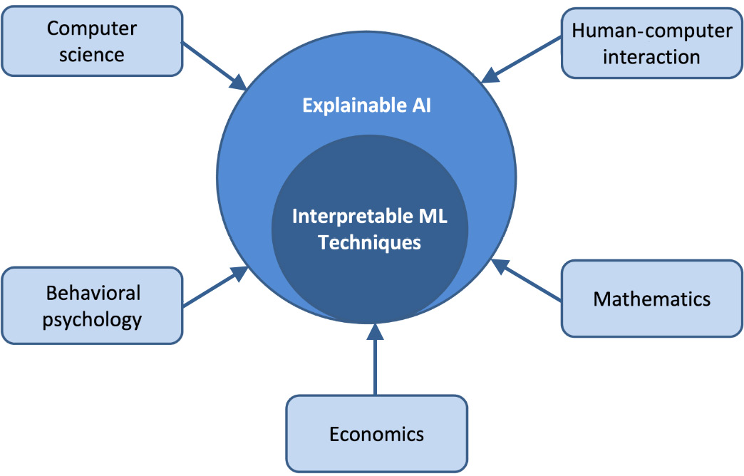
Figure 9.1 – A human-centric XAI system
The development of XAI has accelerated alongside that of applied AI/Deep Learning (DL) systems from roughly 2015. Progressively complicated DL models, such as deep neural networks, have revealed new explainability challenges for both developers and model stakeholders. When it comes to the implementation of AI, not even engineers or data scientists have a clear picture of what’s going on behind the scenes because of the characteristic black-box nature of neural networks. As a result, it becomes difficult to understand a model’s predictions and trust them in high-stakes situations.
XAI is a solution when we want to determine whether we can trust the result of our AI model and how confident we should be that the model is correct. It allows us to understand how the AI model came up with its result in a certain situation and, consequently, builds trust in those outcomes.
To achieve a reliable XAI system, we should focus on three main components: prediction accuracy, traceability, and decision understanding, as shown in Figure 9.2:
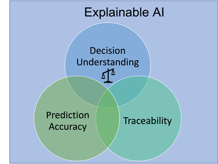
Figure 9.2 – Three main components of an XAI system
Let’s discuss each of these components:
- Prediction accuracy addresses technology requirements and is undoubtedly a vital component in the success of AI usage in day-to-day operations. Prediction accuracy can be determined by comparing XAI output to the results in the training/test dataset. For example, we can use algorithms such as LIME to explain predictions made by AI/DL/ML classifiers.
- Decision understanding addresses human requirements and is all about educating and informing teams in order to overcome AI distrust and help them to understand how decisions were made. This information can be presented to end users in the form of a dashboard displaying the primary factors in the making of a certain decision and the extent to which each of those factors influenced the decision.
- Traceability can impact and limit decision-making, setting up a narrower scope for ML rules and features. Techniques such as Deep Learning Important FeaTures (DeepLIFT) can be utilized to compare the activation of each neuron in a neural network to its reference neuron by displaying traceability links and dependencies.
With no or little understanding of how AI decisions are derived, the user’s trust in the framework is harmed and it may ultimately lead to model rejection. Consider a system making recommendations to users about connections to add to their network or products to buy. An explanation of these recommendations will act as a catalyst in the adoption of ML systems by making information more significant to the user.
XAI is about more than building trust in the model; it is also about troubleshooting and improving the model’s performance. It allows us to investigate model behavior by tracking model insights on deployment status, fairness, quality, and model drift. By using XAI, model performance can be analyzed and alerts can be generated when a model deviates from the intended outcomes and gives a substandard performance.
Scope of XAI
Having an understanding of models is crucial for many tasks involved in building and operating ML systems, and XAI can be used to do the following:
- Hone modeling and data collection processes: After aggregating and comparing across dataset splits, XAI provides a means to identify and alert users of common ML pitfalls such as data skew and drift.
- Debug model performance: It allows us to debug unexpected behavior from the model and monitor deeper feature-level insights to inform corrective actions.
- Build trust: It informs and supports the decision-making process by explaining predictions to build trust with end users, making model decisions equitable and reliable.
- Identify unexpected predictions: It verifies model behavior and informs on amendatory actions. For instance, it allows regulators to efficiently validate that ML decisions comply with laws to mitigate the risk of generating poor model outcomes for end users.
- Act as a catalyst: It acts as a catalyst for the adoption of ML systems by building user trust and presenting model outcomes in understandable forms to stakeholders.
In an ideal world, an explainable and transparent model can be used across distinct industries, such as healthcare, by accelerating diagnostics, processing images, streamlining pharmaceutical process approvals, and making critical decisions in manufacturing, finance, logistics, and criminal justice, such as accelerating the conclusions of DNA analysis or prison population analysis.
Explainability can help developers to ensure that the system is working as expected, meets regulatory standards, and even allows the person affected by a decision to challenge that outcome. The ability to understand and explain model predictions allows companies and institutions to make informed decisions, especially where stakeholders require justifications, such as in strategic business decisions.
Challenges in XAI
Some of the challenging dilemmas faced when implementing XAI solutions are as follows:
- Algorithm confidentiality: Often, due to security concerns, the details of the model and algorithms used are confidential. In such a scenario, it becomes a challenging task to ensure that the AI system did not learn a biased perspective (or an unbiased perspective of a biased world) as a result of gaps in the training data, objective function, or model.
- Fairness: It is challenging for XAI to determine whether a decision taken or an output obtained from an AI framework is fair or not, as the impression of fairness is subjective and relies upon the data used to train the AI/ML model. Furthermore, the definition of fairness can change depending on the use case, culture, and so on.
- Reliability: Without evaluating the process of how the AI system reached a certain outcome, it becomes hard to rely on the system, as clarification is required on whether the system is legitimate or not.
Building a model that can be explained and interpreted easily is the key to overcoming the aforementioned challenges. Highly intricate algorithms can be recreated or replaced with simpler approaches, which are easier to explain with the help of XAI.
Classification of XAI techniques
XAI techniques can be classified based on two main criteria—scope and model. Refer to Figure 9.3:
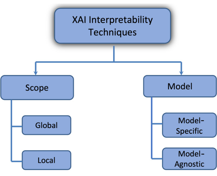
Figure 9.3 – Classification of XAI techniques
Let’s discuss each technique:
- Scope: XAI techniques can be classified based on the scope of their explanation. There are two main categories of XAI techniques in terms of scope: local and global. Local explanations focus on describing the behavior of an AI model for a specific input or output. These explanations provide insights into how the model arrived at a particular decision for a given input and are useful for understanding the model’s behavior in specific cases. Global explanations, on the other hand, provide insights into the general behavior of an AI model across a wide range of input and output. These explanations are useful for understanding the overall decision-making process of an AI model and how it handles different types of input.
- Model: XAI techniques can also be classified based on the type of model they are applied to. There are two main categories of XAI techniques in the context of models: model-specific and model-agnostic. Model-specific explanations are tailored to the architecture and design of a particular AI model. These explanations are often local in scope, providing insights into the behavior of the model for a specific input or output. Examples of model-specific XAI techniques include feature importance analysis and saliency maps. Model-agnostic explanations, on the other hand, are not specific to any particular AI model and can be applied to a wide range of different models. These explanations are often global in scope, providing insights into the overall behavior of an AI model across a wide range of input and output. Examples of model-agnostic XAI techniques include counterfactual analysis and model distillation.
Figure 9.4 expands on the differences between model-specific and model-agnostic XAI techniques:
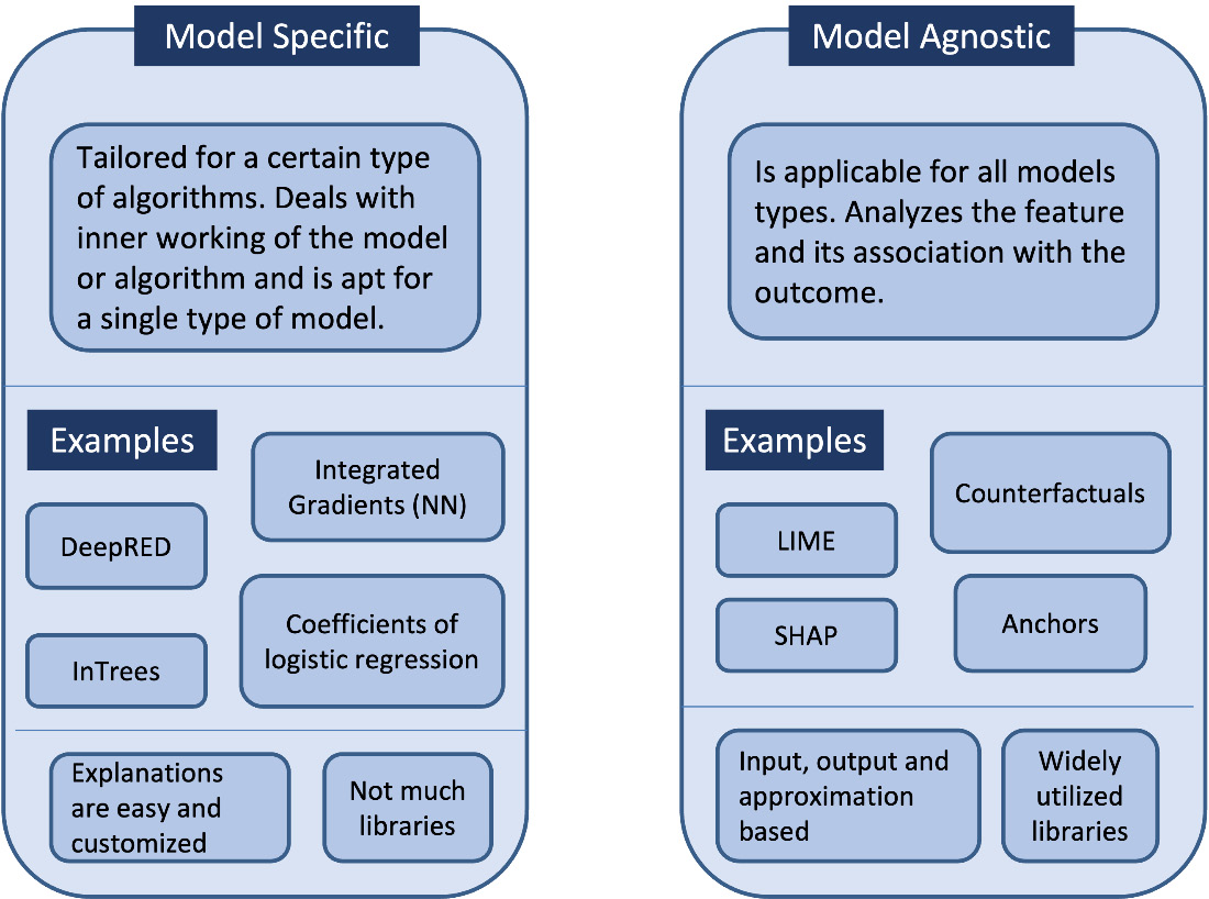
Figure 9.4 – Model-specific versus model-agnostic XAI techniques
Overall, XAI techniques can be classified based on their scope (local or global) and how they relate to the model they are applied to (model-specific or model-agnostic). Understanding the different types of XAI techniques and how they can be applied can help practitioners choose the most appropriate technique for a given situation and better understand the behavior of their AI models.
Let’s now explore some Python libraries that can be used for model explainability.
Explain Like I’m Five (ELI5)
This Python library enables us to visualize and debug ML models. It displays functionality for both local and global interpretations. XGBoost, LightGBM, scikit-learn, Lightning, and CatBoost are some of the libraries supported by ELI5. The goal of ELI5 is to make the explanations accessible to a general audience, including those who may not have a background in AI or ML.
Here is an example of how ELI5 could be used to provide an explanation for the predictions made by an AI model.
Imagine that an AI model has been trained to predict the likelihood of a patient developing a particular disease based on various medical characteristics, such as age, gender, and medical history. The model predicts that a particular patient has a high likelihood of developing the disease. To provide an ELI5 explanation for this prediction, the model could provide a simple and easy-to-understand explanation such as Based on your age, gender, and medical history, our model predicts that you have a high chance of developing the disease. This is because people with similar characteristics have a high risk of developing the disease according to our data. This ELI5 explanation provides a clear and concise explanation for the prediction made by the model, using language and concepts that are accessible to a general audience. It also highlights the factors that the model considered when making the prediction, which can help to increase the transparency and accountability of the AI system.
With the following, we present a general outline of how ELI5 can be implemented in code:
- First, the AI model that you want to explain should be trained and deployed. This could be an ML model, a DL model, or any other type of AI model.
- Next, you will need to select the input or output of the model that you want to explain. This could be a single prediction made by the model or a batch of predictions.
- You will then need to choose an ELI5 explanation method that is appropriate for your model and the type of explanation you want to provide. There are many different ELI5 methods, including methods that provide feature importance explanations, saliency maps, and counterfactuals.
- Once you have selected an ELI5 method, you can use it to generate an explanation for the input or output of the model. This may involve running the input or output through the ELI5 method and then processing the resulting explanation to make it simple and easy to understand for a general audience.
- Finally, you can present the ELI5 explanation to the user clearly and concisely, using language and concepts that are accessible to a general audience. This could involve displaying the explanation in a user interface, printing it to the console, or saving it to a file.
However, there are some limitations to ELI5. One limitation is that it may not be possible to provide a simple and easy-to-understand explanation for every decision made by an AI model. In some cases, the decision-making process of an AI model may be too complex or nuanced to be explained simply. Another limitation is that ELI5 explanations may not always be sufficient to fully understand the behavior of an AI model, especially for those with a more technical background. In these cases, more detailed and technical explanations may be necessary. Also note that it does not work with all models – for example, with scikit-learn, it works only on linear classifiers, regressors, and tree-based models. With Keras, it supports the explanation of image classifiers using Grad-CAM visualizations.
LIME
LIME is a popular XAI technique that’s used to provide local explanations for the predictions made by an AI model. The goal of LIME is to provide an explanation of how an AI model arrives at a particular prediction from a specific input that is simple and easy to understand for a general audience.
LIME is model-agnostic, which means that it can be applied to a wide range of different AI models, regardless of their architecture or design. This makes it a flexible and widely applicable tool for explaining the behavior of AI models.
When generating explanations with LIME, the technique first generates a set of perturbed versions of the input data, called perturbations. These perturbations are obtained by randomly changing the values of some of the input features (one at a time) while keeping the other features unchanged. The AI model is then used to make predictions for each of the perturbations, and the resulting predictions are used to build a simple linear model that approximates the behavior of the AI model in the local region around the original input. This linear model is then used to provide an explanation for the prediction made by the AI model. The explanation can be presented to the user in the form of a list of the most important features that contributed to the prediction, along with the relative importance of each feature.
For example, consider an email classification system that uses an AI model to classify emails as spam or not spam. To explain the classification of a particular email using LIME, the algorithm might generate a set of perturbations by randomly altering the words in the email while keeping the other features unchanged. The AI model would then make predictions for each of the perturbations, and the resulting predictions would be used to build a simple linear model that approximates the behavior of the AI model in the local region around the original email.
The linear model generated by LIME could then be used to provide an explanation for the classification of the original email, such as a list of the most important words in the email that contributed to the classification, along with the relative importance of each word. This explanation would be locally faithful to the email, meaning that it would accurately reflect the behavior of the AI model in the local region around the email, and would be learned over an interpretable representation of the email (that is, a list of words).
LIME is a useful tool for understanding the behavior of AI models and for providing simple and easy-to-understand explanations for the predictions made by these models. However, it has some limitations, such as the fact that it is only able to provide local explanations and may not be able to capture the full complexity of an AI model’s decision-making process.
Let’s now move on to the next tool in our toolbox: SHAP.
SHAP
SHAP (short for SHapley Additive exPlanations) is another popular XAI technique. The goal of SHAP is to explain the overall decision-making process of an AI model and how it handles different types of input and to provide an explanation for this process that is simple and easy to understand for a general audience.
SHAP is based on the concept of Shapley values from game theory, which provides a way to fairly distribute the contributions of different players toward a collective outcome. In the context of XAI, SHAP uses Shapley values to calculate the relative importance of each feature in an input data point to the prediction made by an AI model.
To generate explanations with SHAP, the technique first calculates the Shapley values of each feature in the input data. This is done by considering all possible combinations of the input features and the corresponding predictions made by the AI model and then using these combinations to calculate the relative contribution of each feature to the prediction.
The Shapley values calculated by SHAP are then used to provide an explanation for the prediction made by the AI model. This explanation can be presented to the user in the form of a list of the most important features that contributed to the prediction, along with the relative importance of each feature.
Shapley values and cooperative games
Shapley values are based on the concept of a cooperative game in which a group of participants collaborates to attain a shared goal. The Shapley value is a measure of a player’s contribution to the collective outcome, taking into consideration the efforts of all other members. Shapley values offer a fair value to each player based on that player’s contribution to the group outcome. This means that each participant receives credit solely for the value they provide to the outcome while accounting for the efforts of the other players. Consider a group of individuals who are collaborating to build a house. Taking into consideration the efforts of all other participants, the Shapley value of each participant would represent their contribution to the construction of the house. A person who builds the house’s foundations would receive credit for the foundations’ worth, but not for the roof or walls, and so on, which were contributed by other people.
SHAP is a powerful and widely applicable tool for understanding the behavior of AI models and for providing global explanations for the predictions made by these models. However, it has some limitations, such as the fact that it can be computationally expensive to calculate Shapley values for large datasets. In addition, SHAP explanations may not always be easy for users with a limited technical background to interpret.
Now that we have seen some tools that can be used to explain model predictions, let’s see how we can use them.
Understanding churn modeling using XAI techniques
Now that you have an idea of the ELI5, LIME, and SHAP techniques, let’s use them on a real-life problem. For the purpose of demonstration, we will consider the problem of churn modeling.
Churn modeling is a type of predictive modeling used to identify customers who are likely to stop using a company’s products or services, also known as churning. Churn modeling is commonly used in industries such as telecommunications, financial services, and e-commerce, where customer retention is an important factor for business success.
Churn modeling typically involves building a predictive model using ML or other statistical techniques to identify the factors that are most likely to contribute to customer churn. The model is trained on data covering past customers, including information about their demographics, usage patterns, and churn status (that is, whether they churned or not). The model is then used to make predictions about the likelihood of future customers churning based on their specific characteristics and behavior.
It can be used to identify high-risk customers who are likely to churn so that the company can take proactive measures with those customers to retain their customers, such as offering discounts and incentives to encourage them to continue using the company’s products or services. It can also be used to understand the factors that contribute to customer churn more broadly so that companies can take steps to address these factors and improve general customer retention.
We will start by building a model to predict churn. For the purpose of this example, we are using the the Churn Modeling dataset available at https://github.com/sharmaroshan/Churn-Modeling-Dataset. The data consists of 10,000 data points with 14 features. Figure 9.5 shows the results of some data exploration:
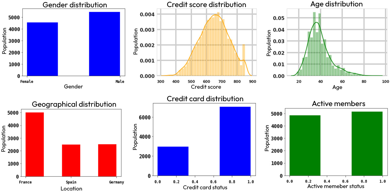
Figure 9.5 – Data exploration on the churn-modeling dataset
Let’s start building the model.
Building a model
Now that we have seen the data, let’s start building a model to use it. Since our focus is on explaining how to use the Python libraries discussed earlier, we will make a simple Random Forest classifier using scikit-learn.
Here are the steps for it:
- First, we import all the packages needed to build the model, along with the packages required to build the explanation (namely, ELI5, LIME, and SHAP):
- Next, we download the data and get the features and output from it; then, we one-hot encode the categorical variables,
GeographyandGender: - Let’s also drop all irrelevant columns from the DataFrame:
- Now, we split the data into training and test datasets:
- Let’s now define the Random Forest classifier and train it on the training dataset:
- Next, we use the trained model to make predictions on the test dataset. We can see that it gives an accuracy of 86% on the test dataset:
- We can also see the ROC curve for the prediction on the test dataset:
This is how the ROC curve appears:
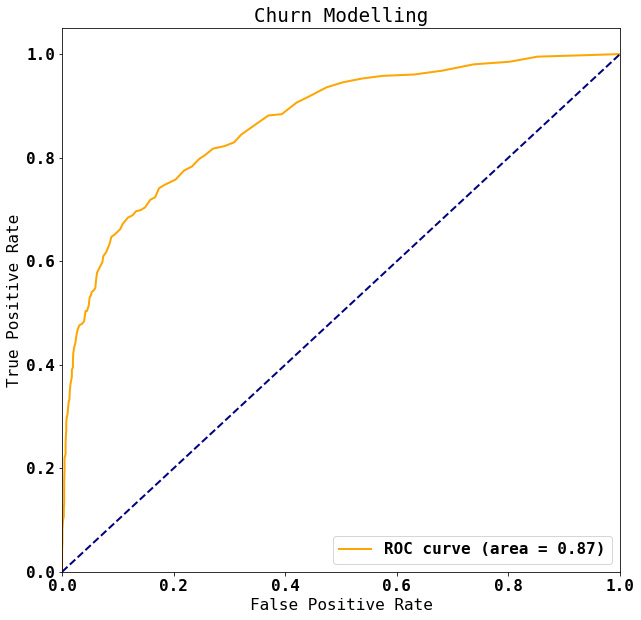
Figure 9.6 – ROC curve
The area under the ROC curve is ~0.87, which is conventionally considered a mark of a fairly good classifier.
- Since we used a Random Forest classifier, let’s explore the feature importance based on the default Mean Decrease in Impurity (MDI) criterion. The following is the code to obtain this. To make it easy to understand, we plot the feature importance as a bar chart:
This is how the bar chart appears:
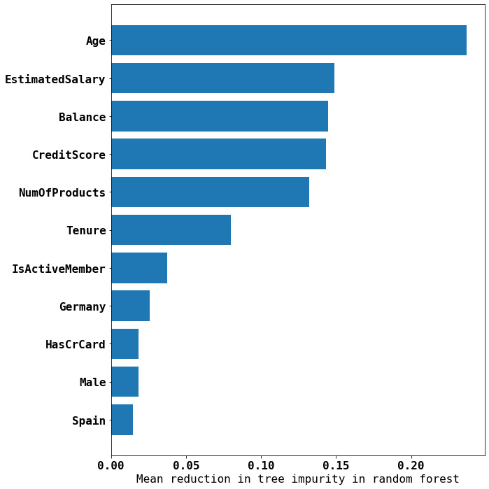
Figure 9.7 – Feature importance using scikit-learn’s MDI criteria
In the preceding figure, we can see that the top five features responsible for whether or not a given customer will stay or churn are their age, their estimated salary, the balance they have, their credit score, and the number of products they’ve bought.
Next, we use ELI5 to understand the classifier.
Using ELI5 to understand classifier models
We use the PermutationImportance method of ELI5 to explain the classifier model we have built. PermutationImportance is a feature importance measure implemented in ELI5 that can be used to get an estimate of feature importance for any black-box estimator. The idea behind PermutationImportance is to randomly permute the values of a single feature, and then measure the impact of the permutation on the chosen model’s performance. The more the model’s performance is affected by the permutation, the more important the feature is considered to be. We pass the trained model and dataset as input to the PermutationImportance class defined in ELI5. Let’s begin with this:
- In the following code, we use the area under the ROC curve as a measure to evaluate the importance of different features in the trained model:
- Let’s calculate the feature importance using the training dataset:
- We can now get the permutation importance of each feature using the
explain_weightsorshow_weightsfunction: - The
imp_dfDataFrame contains the estimator parameters. Again, for ease of understanding, it would be good to reorder them and plot the results as a bar chart. Here, we have the relevant code followed by the bar chart:
Here is the bar chart:
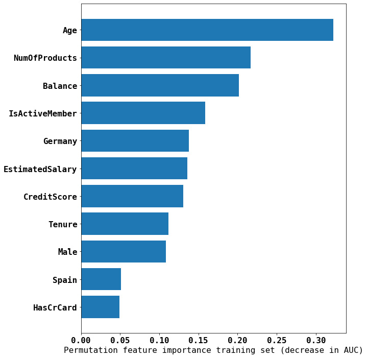
Figure 9.8 – Feature importance using ELI5 PermutationImportance with AUC as the score
According to this graph, age is the most important factor, followed by the number of products bought, the balance, and whether the person is an active member or not.
Let’s now try and explain the model’s prediction using LIME.
Hands-on with LIME
You can use LIME for any type of dataset, whether it’s tabular, textual, or image-based. In this section, we will introduce the use of LIME to understand the predictions made by our Random Forest classifier for churn modeling.
Here, we have tabular data. By using LIME, we can gain a better understanding of how our model is making decisions and identify the factors that are most important in predicting churn:
- Since it is tabular data, we will use the
LimeTabularExplainerclass defined inlime_tabular:
Note
Ideally, we should not one-hot encode the categorical features, as when LIME tries to make its predictions, it might give nonsensical input. For more information, please see the thread at https://github.com/marcotcr/lime/issues/323.
- We can now use LIME to explain the prediction for an instance. We chose the following instance:
- Now, we use LIME’s
explain_instancefunction to outline its interpretation of the input:
This is how the output appears:
![Figure 9.9 – Feature importance using the LIME explainer for the X_test.iloc[3] instance](https://static.packt-cdn.com/products/9781803237077/graphics/image/Figure_9.09_B18681.jpg)
Figure 9.9 – Feature importance using the LIME explainer for the X_test.iloc[3] instance
The LIME explainer tells us that for the given customer, the probability of churn is negligible (0.01). Further, in the middle of the preceding results, we can see the factors that contribute to each class along with the nature of their contribution. Again, we find that age has the largest impact on the prediction.
We can see that all tools are pointing in the same direction: Age is an important feature for churn modeling. Let’s see what SHAP says.
SHAP in action
In this section, we will show you how to use SHAP to explain the predictions made by our churn-modeling model. SHAP is a powerful XAI technique that allows us to understand the relative importance of each feature in an input data point to the prediction made by an ML model. Using SHAP, we can gain a better understanding of how our model is making decisions and identify the factors that are most important when predicting churn:
- We will use the SHAP
TreeExplainerclass, which is specifically designed for use with tree-based models. TheTreeExplainerclass works by traversing the decision tree of the model and calculating the contribution of each feature to the prediction made at each tree node. The contributions are then aggregated to generate a global explanation for the prediction made by the model: - Let’s now use it on the same instance that we used for LIME,
X_test[3]:
This will generate a SHAP force plot for the given instance. The force plot visually explains the factors that contributed to the prediction of this specific instance. The relative importance of each feature in the input data is shown, along with how each feature influenced the prediction. The first argument, explainer.expected_value[0], says that the expected value for the model for this instance is 0 – that is, it belongs to the 0 class, meaning no churn. The second argument, shap_values[0][3,:], provides an array of SHAP values for our given instance. The SHAP values represent the contributions of each feature to the prediction made by the model for the 0 class. Here, you can see the plot:
![Figure 9.10 – SHAP force plot for the X_test.iloc[3] instance](https://static.packt-cdn.com/products/9781803237077/graphics/image/Figure_9.10_B18681.jpg)
Figure 9.10 – SHAP force plot for the X_test.iloc[3] instance
As we can see, the SHAP force plot shows a linear axis. This axis represents the model’s output. You should also see a set of horizontal bars that represent the features in the input data. The plot also includes a baseline value, which is the expected value of the model’s output for the class or label being explained. The length of each horizontal bar represents the relative importance of the corresponding feature to the prediction. A longer bar indicates greater importance, while a shorter bar indicates lower importance. The color of each bar indicates how the value of the corresponding feature influenced the prediction. A blue bar indicates that a higher value for the feature led to a higher prediction, while a red bar indicates that a higher value for the feature led to a lower prediction.
- We can also use dependence plots with SHAP to get an understanding of the relationship between a specific feature in an input dataset and the predictions made by the model. The following command produces a plot showing the effect of the
Agefeature on the prediction for the 0 class:
Here is the plot for it:
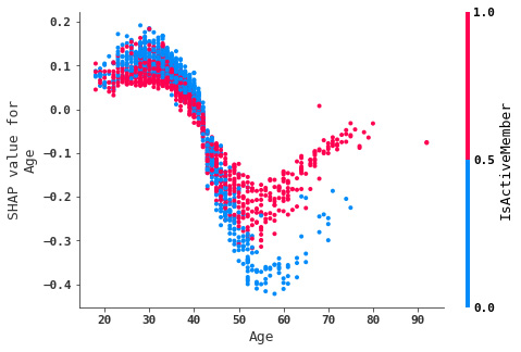
Figure 9.11 – SHAP dependence plot for the Age feature
- The summary plot lets us visualize the feature importance of all the input features. Here is the code for it:
And the plot is as follows:
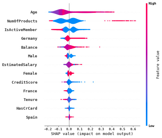
Figure 9.12 – SHAP summary plot
The SHAP summary plot consists of a vertical axis that represents the model’s output (often labeled as f(x)) and a set of horizontal violin plots that represent the distribution of the SHAP values for each feature. The violin plots show the distribution of the SHAP values for each feature across all instances in the dataset and can be used to understand how the value of each feature influenced the predictions made by the model.
The libraries that we’ve examined up to now offer us many insights into our model’s predictions based on the importance of each feature involved. Let’s move on to libraries that provide cause-effect analysis.
CausalNex
CausalNex, an open source Python library, allows us to develop models that help to infer causation rather than observing correlation. The what if library offered by CausalNex is deployed to test scenarios utilizing Bayesian networks and develop causal reasoning. Some prominent features of CausalNex are as follows:
- Simplifying causality understanding in Bayesian networks via visualization: One of the main features of CausalNex is its ability to simplify the understanding of causality in Bayesian networks through visualizations. The library provides a range of tools for visualizing Bayesian networks, including network plots, influence plots, and decision plots, which allow users to see how different variables are connected and how they influence each other.
- Understanding conditional dependencies between variables: CausalNex also provides tools for understanding conditional dependencies between variables. The library includes state-of-the-art structure learning methods, which are algorithms that can automatically learn the structure of a Bayesian network from data. These methods allow users to identify the relationships between variables and understand how they are influenced by other variables in the network.
- Augmenting domain knowledge: CausalNex also provides tools for augmenting domain knowledge, which refers to the specific knowledge and expertise that users bring to the modeling process. The library allows users to incorporate their domain knowledge into the structure of the Bayesian networks, which can help improve the accuracy and reliability of the model.
- Evaluating the quality of the model: CausalNex includes tools for evaluating the quality of the model, such as statistical checks and model selection methods. These tools allow users to ensure that the model they have built is accurate and appropriate for their specific problem.
- Building predictive models based on structural relationships: The library also includes tools for building predictive models based on the structural relationships in the Bayesian networks, which can be useful for making predictions about future outcomes or for testing scenarios in a “what if” manner.
In the following figure, you can see a graph showing the causal relationships between a student’s performance and the factors that might play a role in it:
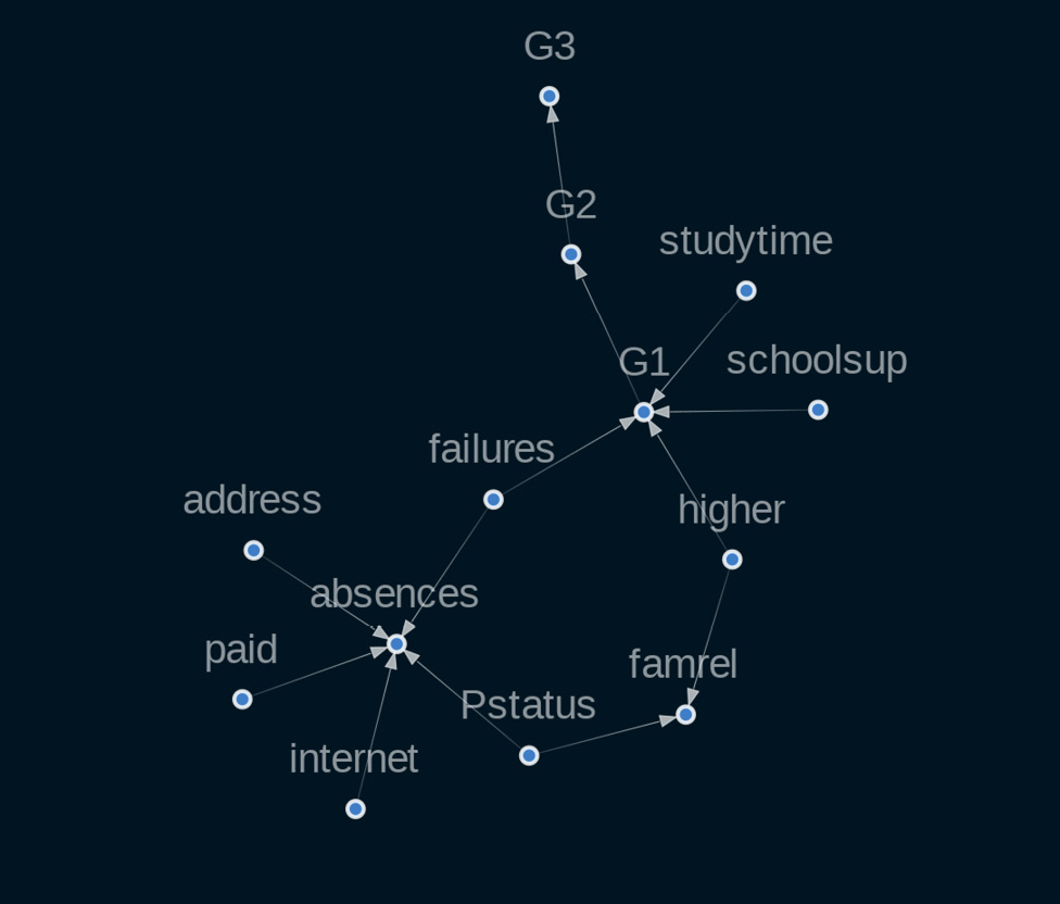
Figure 9.13 – Subgraph showing causal relationships between different factors affecting a student’s performance
This result is obtained from the introductory tutorials on CausalNex at https://causalnex.readthedocs.io/en/latest/03_tutorial/01_first_tutorial.html. We can see that excessive internet usage can result in an increase in absence from school. Similarly, if the student increases the time spent studying, their grades (G1) go up.
Overall, CausalNex is a powerful toolkit for causal reasoning using Bayesian networks. It offers a range of features for simplifying the understanding of causality, understanding conditional dependencies between variables, augmenting domain knowledge, evaluating the quality of the model, and building predictive models based on structural relationships.
Let’s now explore the next Python library for causal inference, the DoWhy library.
DoWhy for causal inference
DoWhy is a Python library for causal inference and analysis. It is designed to support interoperability with other causal estimation libraries, such as Causal ML and EconML, allowing users to easily combine different methods and approaches in their analysis.
One of the main features of DoWhy is its focus on robustness checks and sensitivity analysis. The library includes a range of methods for evaluating the robustness of causal estimates, such as bootstrapping and placebo tests. These methods help users to ensure that their estimates are reliable and not subject to bias or confounding factors.
In addition to robustness checks, DoWhy also offers an API that follows the common steps involved in causal analysis. These steps include creating a causal model, identifying the effect of interest, estimating the effect using statistical estimators, and validating the estimate through sensitivity analysis and robustness checks.
To create a causal model, users can use DoWhy’s causal graph and structural assumption tools to represent the relationships between variables and specify the underlying assumptions of the model. Once the model has been created, users can use DoWhy’s identification tools to determine whether the expected effect is valid and then use the library’s estimation tools to estimate the effect. Finally, users can use DoWhy’s validation tools to make sure that the estimate is accurate and reliable using sensitivity analysis and robustness checks.
This library makes three main contributions to the field of causal inference:
- Model the problem as a causal graph: DoWhy allows users to represent their problems as causal graphs, which are graphical representations of the causal relationships between variables. By modeling the problem as a causal graph, users can make all of their assumptions explicit, which helps to ensure that the assumptions are transparent and can be easily understood.
- Unified interface: DoWhy combines the two major frameworks of graphical models and potential outcomes, providing a unified interface for many different causal inference methods. This allows users to easily combine different methods and approaches in their analysis, and to choose the method that is most appropriate for their specific problem.
- Automatic tests for the validity of assumptions: DoWhy includes a range of tools for testing the validity of assumptions, such as robustness checks and sensitivity analysis. By automatically testing for the validity of assumptions, users can ensure that their estimates are reliable and not subject to bias or confounding factors.
DoWhy breaks down the process of causal inference into four steps: modeling, identification, estimation, and refutation. During the modeling step, users create a causal graph to encode their assumptions. In the identification step, users formulate what they want to estimate. During the estimation step, users compute the estimate using statistical estimators. Finally, in the refutation step, users validate the assumptions through sensitivity analysis and robustness checks.
Let’s get our hands dirty and play a little with DoWhy.
DoWhy in action
We will use a simple synthetic dataset to demonstrate the features of the DoWhy library:
- Start by importing the DoWhy library and the components we will be using, as follows:
- Next, using DoWhy’s
linear_datasetfunction, we generate a synthetic dataset such that the relationship between a treatment and the outcome of interest is linear, also called the linear treatment effect (in our case, we chosebeta=10, so the true treatment effect is10). This creates a linear model with the specified treatment effect and generates a set of synthetic data points that conform to this model. The resulting DataFrame contains a column representing the treatment, a column representing the outcome, and a set of columns representing the common causes and instruments. Additionally, thenum_effect_modifiersparameter specifies the number of effect modifiers or variables that modify the treatment effect. Thenum_samplesparameter specifies the number of samples in the dataset, and thetreatment_is_binaryparameter indicates whether the treatment is binary or continuous. If the treatment is binary, then it can take only two values, effective or not and on or off; if the treatment is continuous, it can take more than two values. Thestddev_treatment_noiseparameter specifies the standard deviation of the treatment noise, which is added to the treatment effect to create the synthetic data. The generated data is adictdata type. The DataFrame (df) is then extracted from it: - The
dfDataFrame will have 11 columns, with columnv0as the treatment name, the outcome being in columny,W0-W4representing the five common causes,Z0andZ1for the two instruments, andX0andX1for the two effect modifiers. Now, we use theCausalModelclass to create a causal model for our synthetic data. TheCausalModelclass uses the following parameters:data: A pandas DataFrame that holds the data.treatment: The column in the DataFrame to be treated as thetreatmentvariable. It represents the intervention or action that is being taken to affect the outcome.outcome: The column in the DataFrame to be treated as the outcome variable.common_causes: The columns to be treated as common causes. These represent the variables that can affect both the treatment and outcome and are also called confounding variables.instruments: This represents the instruments. These are the variables that are used to infer causality.
This creates a graphical model that represents the structure of the causal relationships in the data. The graph parameter specifies the causal graph, which encodes the structure of the causal relationships between the variables in the model. Here, we are using the Graph Modeling Language (GML) file format of our causal graph:
Let’s view the model.view_model() graph:
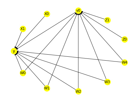
Figure 9.14 – Causal graph for the dataset
- Next, we see the target variables that are to be estimated and the assumptions needed to identify them. The result tells us the estimands (causal estimands as estimated by the model, which describe the causal effect of interest), their names, the expression (a mathematical expression of estimands in terms of variables of the model), and the assumptions needed:
- Let’s now use the
estimate_effectmethod to identify the estimand to compute an estimate of the treatment effect. We can see that the mean value of the estimate is9.162, which represents the average effect of the treatment on the outcome across all individuals in the population: - You can employ the
refute_estimatefunction to test the robustness of an estimate of the treatment effect to various types of perturbations in the data or assumptions of the model.
Overall, DoWhy is a powerful tool for causal inference and analysis. It offers a range of features for creating causal models, identifying effects, estimating effects, and validating estimates, making it a valuable resource for researchers and analysts working in the field of causal inference.
AI Explainability 360 for interpreting models
AI Explainability 360 is an open source toolkit that offers a variety of techniques for explaining and interpreting ML models. It supports both model-specific and model-agnostic approaches, as well as local and global explanations, providing users with a range of options for understanding their models. In addition, the toolkit is built on top of popular ML libraries, including scikit-learn and XGBoost, making it easy to integrate into existing pipelines.
Some of the features of AI Explainability 360 include the following:
- Model-agnostic and model-specific explainability techniques: AI Explainability 360 provides both model-agnostic and model-specific explainability techniques that can be used to understand and explain the predictions of any AI model. Model-agnostic techniques, such as LIME and SHAP, can be used to explain the predictions of any model, while model-specific techniques, such as feature importance and partial dependence plots, are tailored to specific types of models.
- Local and global explanations: AI Explainability 360 provides both local and global explanations of AI models. Local explanations focus on understanding specific predictions made by the model for individual instances, while global explanations focus on understanding the overall behavior of the model.
- Support for multiple types of data: AI Explainability 360 supports explanations for a variety of data types, including tabular, text, image, and time series data. It provides a range of explainability techniques that are tailored to the specific characteristics of each data type.
- Integration with popular AI frameworks: AI Explainability 360 is designed to be easily integrated with popular AI frameworks, including TensorFlow, PyTorch, and scikit-learn, making it easy to use in real-world applications.
- Extensive documentation and examples: AI Explainability 360 comes with extensive documentation and examples to help users get started with explainability in their own projects.
Overall, AI Explainability 360 is a powerful toolkit for understanding and explaining the predictions made by AI models, and for building transparent, trustworthy, and fair AI systems.
Summary
The future of AI lies in enabling people to collaborate with machines to solve complex problems. Like any efficient collaboration, this requires good communication, trust, clarity, and understanding. XAI aims to address such challenges by combining the best of symbolic AI and traditional ML.
In this chapter, we explored a variety of XAI techniques that can be used to explain and interpret ML models. These techniques can be classified based on their scope (local or global) and their model type (model-specific or model-agnostic).
We covered various Python libraries that provide XAI features and explained how to use ELI5, LIME, and SHAP to explore feature importance in model prediction. LIME can provide instance-based explanations for predictions made by any classifier. LIME approximates the classifier locally with an interpretable model and generates a list of features that contribute to the prediction in a given instance. SHAP uses Shapley values to explain the contribution of each feature to a prediction, supports both local and global explanations, and can be used with a variety of model types.
DoWhy is another library for causal inference and analysis. It offers an API for the common steps in causal analysis, including modeling, identification, estimation, and refutation. Finally, we introduced AI Explainability 360, a comprehensive open source toolkit for explaining and interpreting ML models. It supports both model-specific and model-agnostic explanations, as well as local and global explanations.
In conclusion, there are a variety of tools and libraries available for explaining and interpreting ML models. These tools (such as ELI5, LIME, SHAP, CausalNex, DoWhy, and AI Explainability 360) offer a range of options for understanding how models make their predictions and can be useful for researchers and practitioners working in the field of XAI. However, it is important to note that there are still limitations and challenges in this field.
In the next chapter, we will move on to model risk management and explore best practices for model governance.
References
- Black-box vs. white-box: Understanding their advantages and weaknesses from a practical point of view, Loyola-Gonzalez, Octavio. IEEE Access 7 (2019): 154096-154113.
- Opportunities and challenges in explainable artificial intelligence (xai): A survey. arXiv preprint arXiv:2006.11371, Das, Arun and Rad Paul. (2020)
- A systematic review of human–computer interaction and explainable artificial intelligence in healthcare with artificial intelligence techniques. IEEE Access 9 (2021): 153316-153348, Nazar, Mobeen, et al.
- Why should I trust you? Explaining the predictions of any classifier. Ribeiro, Marco Tulio, Singh Sameer, and Guestrin Carlos. Proceedings of the 22nd ACM SIGKDD International Conference on Knowledge Discovery and Data Mining. 2016.
- A unified approach to interpreting model predictions. Advances in Neural Information Processing Systems 30. Lundberg, Scott M. and Lee Su-In (2017)
- Algorithmic transparency via quantitative input influence: Theory and experiments with learning systems. 2016 IEEE Symposium on Security and Privacy (SP).Datta, Anupam, Sen Shayak, and Zick Yair. IEEE, 2016.
- Explaining prediction models and individual predictions with feature contributions. Knowledge and Information Systems 41.3 (2014): 647-665. Štrumbelj, Erik and Kononenko Igor.
- Bayesian networks, Pearl, Judea. (2011)
- A tutorial on learning with Bayesian networks. Innovations in Bayesian Networks (2008): 33-82. Heckerman, David.
- Probabilistic Graphical Models: Principles And Techniques. MIT Press, 2009. Koller, Daphne and Friedman Nir.
- Causal inference in statistics: An overview. Statistics surveys 3: 96-146. Pearl, Judea. (2009)
- CausalNex docs: https://causalnex.readthedocs.io/en/latest/
- DoWhy GitHub repo: https://github.com/py-why/dowhy
- Introducing AI Explainability 360: https://www.ibm.com/blogs/research/2019/08/ai-explainability-360/